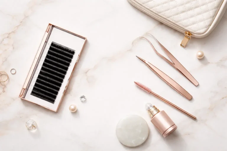

Choose Custom Lash Packaging that protects lash curl, photographs premium, and keeps landed cost predictable—without getting lost in print jargon.
Quick answer (30 seconds)
If you want the safest “looks premium + scales well” path, start with:
- Structure: tuck-end folding carton
- Finish: matte lamination
- Upgrade: one hero effect (small foil logo or spot UV—pick one)
- Fit: paperboard cradle (or a standard tray fit) to prevent movement
Then design backward from a landed packaging cost target (unit cost + freight impact), not just “box price.”
Avoid the common traps: crushed corners, scuffed foil, rattling trays, and “silent” freight cost increases—by choosing structure + insert + finish in the right order.
Who this guide is for
- New lash brands launching their first SKU and need cost control + good photos
- Salon retail / wholesalers who need fast packing and durable handling
- Premium / PR sets where unboxing and perceived value matter
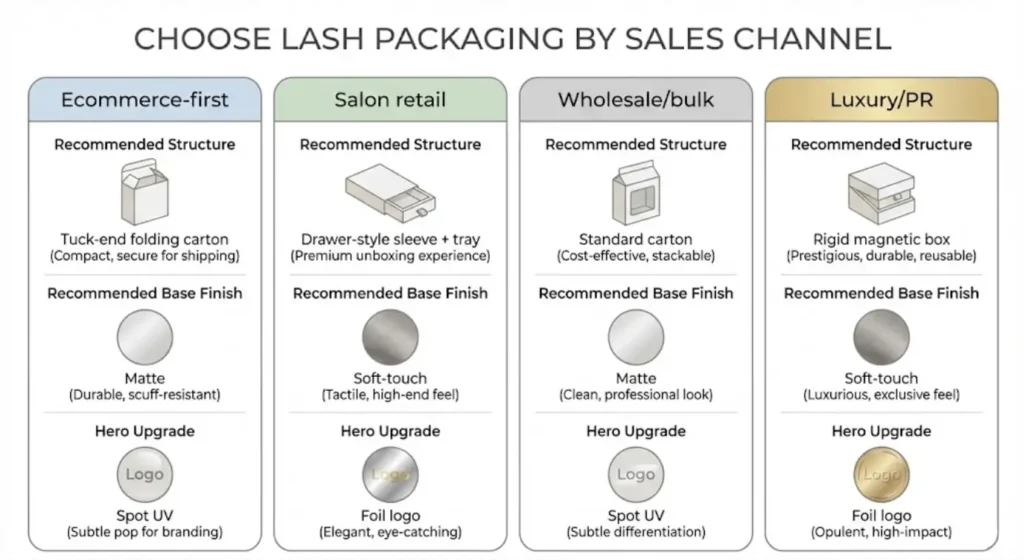
Pick your best option by sales channel
Ecommerce-first (shipping + photos):
- Folding carton + matte (or light soft-touch)
- Prioritize corner crush resistance + scuff resistance
- Avoid oversized boxes (freight + tray movement)
Salon retail (handling + shelf impact):
- Drawer-style carton or upgraded folding structure
- Matte/soft-touch + controlled spot UV pattern
- Prioritize easy open/close and fingerprint management
Wholesale / bulk (stacking + speed):
- Standard tuck-end folding carton
- Simple finish, low setup complexity
- Prioritize fast assembly and consistent unit cost
Luxury / PR / gift set (unboxing):
- Rigid magnetic or rigid drawer
- One hero finish (foil or emboss)
- Add protective inner packing for shipping
Compare at a glance
| Packaging type | Best for | Protection | Packing speed | Freight impact | Typical failure | Main cost pressure |
|---|---|---|---|---|---|---|
| Folding carton | Most brands + scaling | Medium | Fast | Low | Corner crush if thin | Board thickness + finish setups |
| Drawer-style carton | Premium feel, not full rigid | Medium–High | Medium | Medium | Scuffing on sleeves | Assembly + scuff-proof finish |
| Rigid box | Luxury, PR, gift | High | Slow | High | Landed cost creep | Labor + volume/weight |
| Windowed carton / PET | Visibility retail | Medium | Medium | Medium | Scratches + fingerprints | Window material + assembly |
| Clamshell case | Travel/reuse | High | Fast | Medium | Scratches + “plastic feel” | Component cost + perception |
Definition (useful when quoting suppliers): Landed packaging cost = unit packaging cost + assembly/handling + protection materials + freight impact (more air shipped = more cost).
Start with the job your packaging must do
Before you pick a “pretty box,” define your packaging priorities. We typically ask brands to rank these 1–5:
- Protection: Does it survive international shipping and repeated opening?
- Shelf impact: Does it stand out on a salon retail wall or ecommerce photo?
- Speed: Can your team pack orders quickly without fingerprints and scratches?
- Cost control: Can you scale with predictable unit cost and low MOQ options?
- Sustainability: Is the brand story eco-driven, or is durability the priority?
A salon retail box may need “wow” and frequent handling. Ecommerce-first brands often prioritize shipping durability and clean unboxing. Wholesalers might want a structure that stacks well and reduces freight.
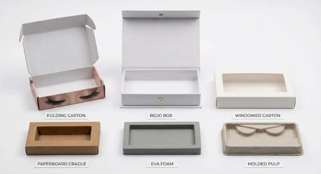
Materials: what your box is actually made of (and why it matters)
1) Folding carton (paperboard)
- Best for: most lash brands, especially when scaling
- Feel: light to medium, crisp edges
- Pros: cost-efficient, great print quality, many finish options, easier to ship flat
- Cons: less “luxury weight” than rigid boxes; corners can crush if too thin
Common paperboard choices include SBS (smooth, premium print surface) or coated duplex boards for cost control. If you want a premium look without premium cost, folding cartons + smart finishes are often the sweet spot.
2) Rigid box (greyboard + wrapped paper)
- Best for: luxury sets, influencer collabs, gift-worthy products
- Feel: heavy, sturdy, premium
- Pros: high-end unboxing, strong protection, holds shape well
- Cons: higher unit cost, higher shipping volume/weight, often higher MOQ
Rigid boxes are impressive—but you pay in material, labor, and freight. If you’re running factory-direct pricing but shipping internationally, rigid packaging can quietly raise landed cost more than the printing itself.
3) Plastic components (PET/PP windows, clear sleeves)
- Best for: visibility-focused designs, “see the lash” retail strategy
- Pros: product visibility, modern look, moisture resistance
- Cons: scratch risk, eco concerns, fingerprints
Windows can sell lashes fast in-store, but they increase assembly complexity and can scratch in bulk transit if not protected.
4) Inserts and trays (paper pulp, foam, EVA, PET)
- Best for: stabilizing lash trays and preventing movement
- Pros: improves protection and presentation
- Cons: major cost driver when custom-shaped
For lash packaging, the insert is often the hidden budget eater—especially if it’s custom-cut to your tray size.
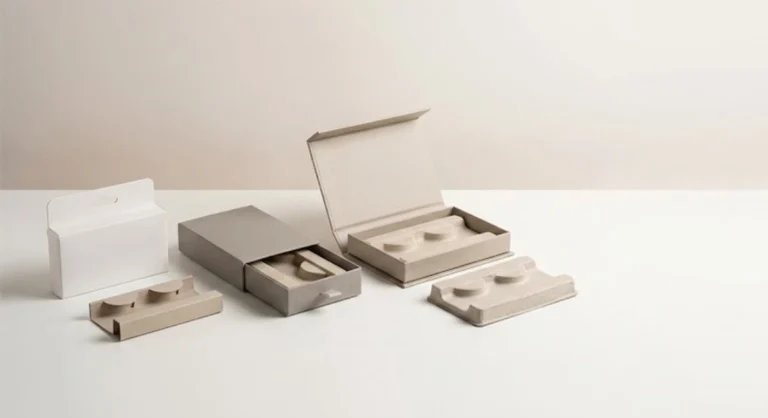
Structures: the box style affects cost, speed, and breakage
Your lash packaging structure is more than a “box style”—it directly impacts unit cost, packing speed, shipping damage rates, and how premium your brand feels. For OEM/private label projects, we usually choose the structure based on your sales channel (salon retail, ecommerce, wholesale) and how often customers will open the box.
1) Tuck-End Folding Box (Standard Carton)
- Best for: everyday retail, ecommerce shipping, and wholesale volume
- Why it works: This is the most scalable custom lash packaging option. It ships flat (lower freight), assembles fast, and keeps per-unit cost predictable—especially when you need low MOQ for a first launch.
- Cost drivers: paperboard thickness, inside printing, and one “hero” finish (foil or spot UV).
- Pro tip: If you want it to look premium without jumping to rigid boxes, pair a tuck-end carton with matte lamination + a small foil logo.
2) Sleeve + Inner Tray (Drawer-Style “Slide Box”)
- Best for: premium positioning without full rigid-box cost
- Why it works: A drawer structure creates a “gift-like” unboxing and displays the lash tray neatly—great for salon retail walls and influencer-ready kits.
- Tradeoffs: It’s slower to pack than a tuck-end carton, and the sleeve edges can scuff if the finish is too delicate.
- Cost drivers: double-layer materials (sleeve + tray), tighter tolerances, and higher assembly labor.
- Pro tip: Choose matte lamination (more scuff-resistant than soft-touch in daily handling) and add a snug insert so the tray doesn’t slide.
3) Magnetic “Book” Rigid Box
- Best for: luxury lash sets, multi-pair kits, PR boxes, and higher AOV launches
- Why it works: This structure signals premium immediately—heavier feel, strong protection, and a high-end unboxing experience.
- Tradeoffs: Higher landed cost because you’re paying for rigid materials + hand assembly + higher freight volume/weight. Many designs also require a higher MOQ due to tooling and setup.
- Cost drivers: box size (air shipping), wrap paper, magnets, custom inserts, and multi-step finishes.
- Pro tip: Right-size the box to the tray and limit finishes to one or two—controlled luxury looks more expensive than over-decorating.
4) Clamshell / Plastic Case
- Best for: travel-friendly, reusable lash storage; artist kits that need durable protection
- Why it works: Solid protection and easy open/close. Customers like the “reusable case” feel—especially for on-the-go wearers.
- Tradeoffs: Plastic can scratch, fog, and show fingerprints quickly, which hurts perceived quality in retail photos.
- Cost drivers: mold/forming complexity, surface treatments, and protective wrapping for transit.
- Pro tip: If you choose plastic, plan for anti-scratch handling (protective film or individual sleeves) and keep branding minimal to avoid rubbing.
Practical tip (salon + repeat-use): If the packaging will be opened repeatedly (salon demos, customer reuse, lash artists storing styles), prioritize hinge strength, tray stability, and scuff resistance over fancy printing. A durable structure reduces returns and keeps your brand looking premium longer.
Printing methods and finishes: where “premium” really comes from
If you’re trying to level up branding, finishes are usually more effective than changing the entire structure.
Printing basics
- CMYK offset printing: best for high-quality color, gradients, photos
- Digital printing: good for smaller runs and prototypes (often higher unit cost at scale)
- Pantone spot colors: consistent brand color matching (extra setup/cost)
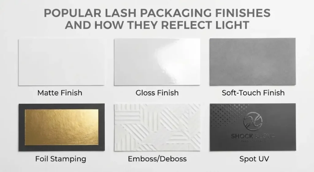
Finishes that customers notice immediately
Matte lamination
Soft, modern, reduces glare in photos. Helps protect print from rubbing.
Gloss lamination
Shiny, high contrast, can look “loud” on luxury designs but works for bold retail.
Soft-touch / velvet lamination
Premium hand-feel. Tradeoff: can show fingerprints and oil marks, especially on dark colors.
Foil stamping (gold/silver/colored)
High impact for logos and accents. Cost driver: each foil color typically needs its own setup.
Emboss / deboss
Adds tactile branding (raised or pressed). Beautiful for minimal designs. Needs precise tooling.
Spot UV
Glossy raised effect on specific areas (logo patterns, icons). Great for contrast on matte backgrounds.
Metallic inks / pearlescent
Subtle shimmer without full foil. Can be a middle ground.
Finish rules that make packaging look expensive (without looking busy)
- Rule 1: Pick 1 hero finish. (foil or emboss or spot UV)
- Rule 2: Add at most 1 supporting finish. (usually matte/soft-touch lamination)
- Rule 3: Use contrast, not clutter. One strong accent on a clean base looks more premium than multiple effects everywhere.
- Rule 4: Design for handling. Dark soft-touch shows fingerprints; high gloss and heavy foil scuff in transit unless protected.
- Rule 5: Tie finishes to the brand story. Eco-minimal brands often win with texture + restraint, not shine.
Practical spec tip: In your quote request, list finishes as “Base protection” (lamination) and “Decorative effect” (foil/emboss/UV). This prevents supplier misunderstandings and surprise setup fees.
Inserts, lash trays, and fit: don’t design a box that fights your product
Custom lash packaging fails most often at the tray fit stage.
The two fit rules we use
- No movement: the tray should not slide or rattle when shaken.
- Easy removal: customers shouldn’t pry so hard they bend the lash band.
Options:
- Paperboard cradle: cost-effective, customizable, eco-friendly
- EVA/foam insert: premium feel, strong hold, higher cost, can collect dust
- Molded pulp insert: eco-friendly, good protection, limited fine detail compared to foam
- PET thermoformed tray: clean look, clear, consistent shape, plastic perception
Salon workflow note: If your customers are artists (not just wearers), they care about how quickly the tray opens, whether the lash strip stays clean, and whether the labeling is readable under a lamp.
Sustainability choices: what’s realistic without compromising quality
Many brands want “eco packaging,” but still need protection and retail appeal. Practical improvements that don’t wreck usability:
- choose recyclable paperboard structures over full plastic clamshells
- minimize plastic windows (or use smaller windows)
- use molded pulp or paperboard inserts instead of foam (where possible)
- reduce finish stacking (some laminations can complicate recycling)
- print inside/outside strategically (less ink coverage can reduce cost too)
We’re always honest here: “eco” and “ultra-luxury” can conflict. A heavyweight magnetic rigid box is often not the most sustainable choice, but you can still make smart compromises (right-sizing, reducing plastics, avoiding over-packaging). For more on our eco-friendly options, see our about page. The real cost drivers in custom lash packaging (and how to control them) Use this as a design-and-quote checklist—each driver has a lever you can pull.
The real cost drivers in custom lash packaging (and how to control them)
Use this as a design-and-quote checklist—each driver has a lever you can pull.
| Cost driver | Why it raises cost | Best lever to control it | Tradeoff (what you give up) | What to tell your supplier |
|---|---|---|---|---|
| Structure (drawer/rigid vs tuck-end) | More steps + labor | Start tuck-end; upgrade only hero SKUs | Less “gift box” feel | structure type + assembly requirements |
| Board grade/thickness | Material + weight | Right-size thickness to channel (ecom vs retail) | Too thin risks crush | board grade + thickness target |
| Insert material & tooling | Custom shapes + setup | Standardize tray size; use paperboard cradle first | Foam feels more “luxury” | tray dimensions + “no movement” rule |
| Finish complexity | Each setup adds cost | 1 hero finish + 1 base protection | Less visual “bling” | list finishes as base vs decorative |
| Print coverage / dark solids | Scuffs show; needs protection | Use design breaks, textures, or mid-tones | Less “solid black” look | artwork coverage notes; scuff requirement |
| MOQ & setup amortization | Setup spread across units | Plan launch + reorder quantities early | Less flexibility on tiny runs | launch qty + reorder plan |
| Box size / freight “air” | Volume ships air | Right-size to tray; avoid oversized presence | Less shelf “bulk” | outer dimensions + packing count/carton |
| Protective transit packing | Prevents scuffs/crush | Add dividers/wrap only when needed | Extra packing steps | transit method + protection plan |
Your budgeting shortcut: Set a landed packaging cost target first (unit cost + freight impact + packing time), then choose structure/finishes to match it.
A practical “tier” approach to packaging design
If you’re not sure what to choose, this framework keeps decisions grounded:
Tier 1: Cost-controlled, scalable (best for first launch)
- folding carton (tuck-end)
- matte lamination
- one simple highlight (small foil logo OR spot UV)
- paperboard insert or standard tray fit
Tier 2: Premium retail (best for salon retail walls)
- drawer-style carton or upgraded folding structure
- soft-touch or matte + spot UV pattern
- stronger insert for zero movement
- inside printing for unboxing experience
Tier 3: Luxury / PR / gift set
- rigid magnetic box or rigid drawer
- foil + emboss (carefully balanced)
- custom insert + multi-pair layout
- higher protection packaging for shipping
This approach helps you keep “premium” aligned with margins and launch stage.
OEM/private label workflow: how to avoid delays and expensive revisions
When we run an OEM/private label project, most packaging delays come from missing technical details. Here’s what speeds everything up:
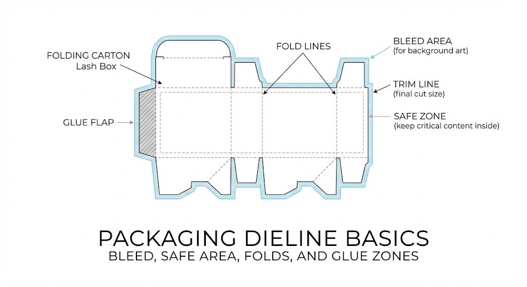
- Dieline confirmed early: exact dimensions, fold lines, glue areas
- Tray size locked: lash tray thickness, curvature, and placement
- Finish callouts clear: foil color, emboss depth, spot UV areas
- Artwork files prepared: vector logo, high-res images, correct bleed
- Barcode/labels planned: where they go without ruining the design
If you’re launching multiple customized lash styles, build a packaging system:
- one master box size that fits several SKUs
- interchangeable labels or sleeves for styles
- standardized tray format
That keeps quality stable and costs predictable—especially when scaling.
Packaging stress test (do this before you approve mass production)
You don’t need a lab to catch 80% of packaging failures—run these quick checks on samples:
- Rattle test (movement): close the box and shake gently. Pass = tray doesn’t slide or click.
- Corner pressure test (crush risk): press corners and edges with firm hand pressure. Pass = no collapse lines, no corner popping.
- Scuff test (finish durability): rub the surface with clean dry hands and a soft cloth. Pass = no visible dulling/transfer on key areas.
- Open/close cycle (salon reality): open and close 20–30 times. Pass = no tearing, magnets/closure still aligns, finish doesn’t peel at edges.
- Unboxing time (packing speed): time one pack-out. Pass = consistent speed without fingerprints/scratches.
Spec line to include in your PO: “Sample must pass rattle, corner pressure, scuff, and open/close cycle checks before bulk approval.”
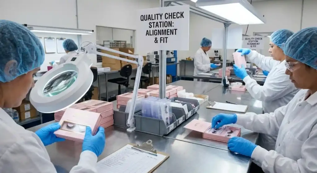
Quality control: what we check so your packaging arrives “retail-ready”
Stable quality is a packaging promise you have to build, not just request. In production, we typically pay close attention to:
- color consistency across batches (especially blacks and nudes)
- foil alignment (logos can drift if tolerances aren’t controlled)
- scuff resistance (rub test, handling simulation)
- glue strength and corner integrity
- insert fit (movement testing)
- carton packing method (prevents corner crush)
Common mistakes and fixes in custom lash packaging
Mistake 1: Choosing a “luxury” finish without planning for fingerprints and scuffs
Why it happens: Soft-touch lamination, matte films, and high-coverage dark inks look premium—but they can show oil marks, dust, and rub lines during packing, retail handling, and shipping.
Fix (what to do):
- Use soft-touch selectively (logo panel or lid only) instead of full-coverage.
- Avoid large solid black areas; break them up with patterns, gradients, or negative space.
- Add a spot UV pattern or light texture to visually “hide” handling marks.
- For high-touch retail, choose matte lamination + spot UV as a cleaner, more durable combo than full soft-touch.
Pro tip for brands/salons: Test your sample by handling it with lotion/hand sanitizer—if it looks dirty fast, your customers will see it too.
Mistake 2: Oversizing the box “for presence” (and paying for air)
Why it happens: Bigger feels more premium, but oversized lash boxes often lead to tray shifting, corner crush, and higher freight costs—especially for cross-border fulfillment.
Fix (what to do):
- Right-size the box to your lash tray and insert (minimal empty space).
- Add “premium” through structure and finish (drawer sleeve, foil logo) rather than extra size.
- Ask for an inner fit test: shake test + drop test in a master carton.
Cost driver reminder: Larger boxes increase carton count, volumetric weight, and shipping cost—often more than the upgrade from matte to soft-touch.
Mistake 3: Using too many effects at once (foil + emboss + spot UV everywhere)
Why it happens: Brands want packaging that looks expensive, so they stack finishes. But too many effects can look busy, reduce readability, and increase production risk (misalignment, inconsistent results).
Fix (what to do):
- Choose one hero effect (foil or emboss or spot UV).
- Add one supporting effect (e.g., matte lamination + small foil logo).
- Keep barcode/labels in clean areas so you don’t cover premium finishes.
Luxury rule we use: Controlled design looks higher-end than “everything everywhere.”
Mistake 4: Tray and insert don’t match (rattle, bending, hard removal)
Why it happens: The box is designed before tray specs are locked, or tolerances aren’t tested with real production trays. This causes movement, lash band bending, or customers struggling to remove the tray cleanly.
Fix (what to do):
- Do prototype fit testing early (not just a visual mockup).
- Lock key specs before mass printing: tray length/width/height + insert depth + clearance.
- Run a simple checklist:
- Shake test: no rattle
- Open/close test: smooth drawer action (if sleeve)
- Removal test: tray lifts out without prying
For OEM/private label: Standardizing tray specs across SKUs can reduce cost and improve stable quality.
Mistake 5: Ignoring shipping protection (scratches, crushed corners, scuffed foil)
Why it happens: Premium finishes can be fragile in bulk transit. Foil can scuff, glossy films scratch, and soft-touch can mark—especially if boxes rub together inside master cartons.
Fix (what to do):
- Add inner protection for scratch-prone finishes: tissue wrap, poly sleeves, dividers, or paper separators.
- Use stronger master cartons and proper carton fill to prevent corner damage.
- Consider a more durable finish if you ship long-distance or through multiple carriers.
Packaging reality: A beautiful box that arrives scratched hurts your conversion more than a simpler box that arrives perfect.
Quick checklist: what to decide before you request a quote
- Target customer: salon retail / ecommerce / wholesale / PR
- Structure: folding carton / drawer / rigid magnetic
- Material: paperboard grade + thickness
- Finish: matte/gloss/soft-touch, foil/emboss/spot UV (how many setups?)
- Insert: type + fit requirements
- Box size: right-sized to tray + reduces air shipping
- Artwork readiness: dieline + bleed + vector logo
- MOQ: launch quantity + reorder plan (ask about low MOQ options)
- Timeline: sampling + production + shipping
- Freight plan: consolidated shipment vs. staggered deliveries
Key Points
- Packaging isn’t just design—structure + insert + freight often drive real cost more than printing.
- Folding cartons can look premium with the right finish and are easier to scale.
- Rigid boxes deliver luxury feel but raise cost through labor and shipping volume.
- Inserts are a major hidden cost driver; fit testing prevents rattling and lash damage.
- One “hero finish” (foil or emboss or spot UV) often looks more expensive than stacking effects.
- Right-sizing packaging protects product and reduces freight—especially for international orders.
- A repeatable packaging system helps brands manage multiple customized lash styles efficiently.
- In OEM/private label projects, early dieline + tray spec lock saves the most time and money.
FAQ
How do we choose packaging if we’re launching on a tight budget?
Start with a folding carton + matte lamination + one small premium touch (foil logo or spot UV). It’s usually the best balance of cost, speed, and shelf presence.
What finish looks most “luxury” in photos?
Matte or soft-touch with restrained foil or spot UV tends to photograph cleanly. Gloss can reflect harsh lighting and look less refined depending on your design.
Can we do eco-friendly packaging without sacrificing protection?
Yes—paperboard structures with paper-based or molded pulp inserts can work well. Just be realistic about reuse and scuff resistance, and avoid fragile, scratch-prone surfaces.
What’s the biggest reason packaging projects get delayed?
Artwork + dieline mismatch, or the tray size changes after the box is designed. Lock the tray specs early and prototype the fit.
How can we keep costs stable as we add more lash styles?
Use a standard box size and structure across SKUs, then differentiate with sleeves, labels, or inside cards. This keeps production efficient and quality consistent.
If you tell us your target positioning (budget / premium / luxury), sales channel (salon / ecommerce / wholesale), and approximate order quantity, we can recommend a packaging structure that fits your brand—and keeps your packaging costs predictable with factory-direct pricing, stable quality, and practical low MOQ options where they make sense. Get a quote.
Reference
ASTM International. (2019). ASTM D5264-98(2019), Standard practice for abrasion resistance of printed materials by the Sutherland rub tester. ASTM International.
FedEx. (n.d.). What is dimensional weight? FedEx.
Foil & Specialty Effects Association. (n.d.). Foil cheat sheet. Foil & Specialty Effects Association.
International Organization for Standardization. (2013). ISO 12647-2:2013 Graphic technology—Process control for the production of half-tone colour separations, proof and production prints—Part 2: Offset lithographic processes. ISO.
International Organization for Standardization. (2013). ISO 18601:2013 Packaging and the environment—General requirements for the use of ISO standards in the field of packaging and the environment. ISO.
International Organization for Standardization. (2016). ISO 14021:2016 Environmental labels and declarations—Self-declared environmental claims (Type II environmental labelling). ISO.
International Safe Transit Association. (n.d.). Test procedures. ISTA.
PakFactory. (2025, May 23). What is spot UV printing? PakFactory Blog.
PakFactory. (n.d.). Rigid box packaging – The master guide. PakFactory Blog.
Pantone. (n.d.). Spot vs. process color. Pantone.
Paperboard Packaging Council. (n.d.). Paperboard Packaging Council (design handbook resource). Paperboard Packaging Council.
Sappi. (n.d.). Paperboard (including SBS/SBB overview). Sappi.